Olivia Newton John sang “Let’s get physical, physical I wanna get physicaa…aaal. Let’s get into physical. Let me hear your body talk, your body talk”. Well our version of the lyrics at this stage of our Deep Learning Classification project is all about the VISUAL.
We want to SEE the results our model has produced for us. In a way that is meaningful to us. A pictorial or graphical representation of the outputs or predictions would be really handy. It’s the reverse of what we do at the beginning.
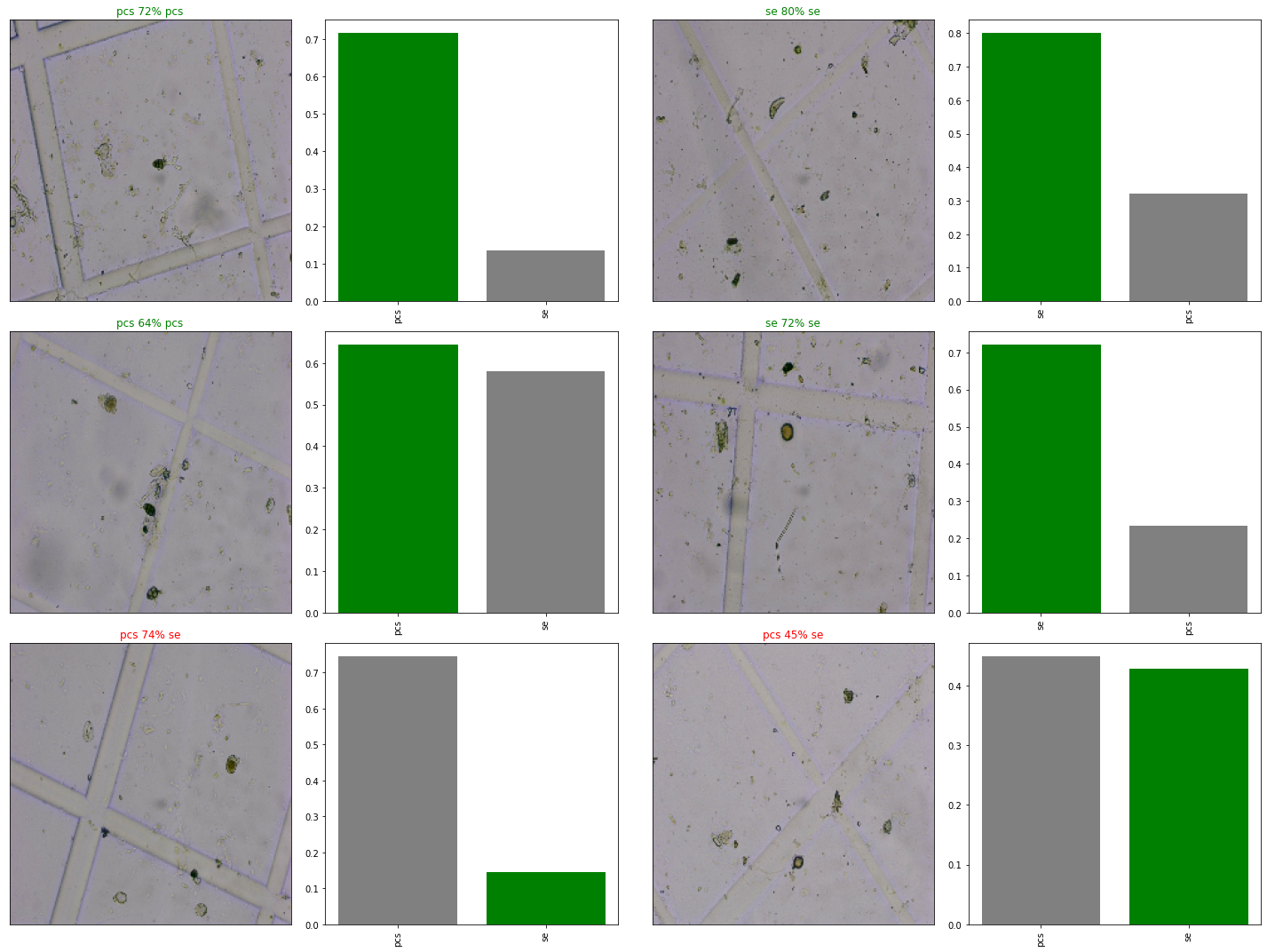
This is the exciting part. The bit where I see my models predictions in the form of a label and then compare it to the truth label. If you look at the blog post image you will see six photos with their corresponding bar graphs I took of spores and other things under a microscope. Here’s a run down of what it all means.
Above each photo of a grid is a title either in green or red. It shows the predicted classification, either “pcs” or “se” , the true label, again either “pcs” or “se and the highest confidence level. “pcs” stands for Pithomyces Chartarum spore and “se” means something else.
To the right of the image is a bar graph showing both confidence levels for the two possible classifications, in descending order, from the highest to the lowest. If the truth label equates to the predicted one with the highest confidence level then the bar becomes green.
This is what happens for the top four examples. Our model predicted the wrong label in the bottom two examples so the title of the photo turns red and the taller bar or classification with the higher prediction value is grey not green.
It’s exciting to see our data “talk”. Or being able to visualize the results of our models work.